 While Times Square is home to MTV Studios, it also holds the Virgin Megastore, the largest music store in the world. That video of Times Square I posted earlier has a glimpse of the lit store. Whether it's a television network, a department store, or just street performers, the aesthetic presence of music within Times Square surely demonstrates Rybacki's take on it. "Music...has always had a visual element...the 'look' a band strived for in performance, concert staging, and promotional publicity have all helped create a visual imagery for rock" (Rybacki). I've already discussed how music videos made the look of a band more important, the use of concert staging to promote a band, but what I have not yet discussed is an album's cover design. "Cover design projects bring together two artists: the designer and the musician. They offer the opportunity to create a visual to represent a non-visual art" (Grant). Serving as a way to identify an album, some album designs have become as famous as the artists who release them. Such designs are featured in the video below (see link) in an entertaining battle that you'll just have to see for yourself:
http://youtube.com/watch?v=x6bUD9PJ6i8
Today it may seem as if album cover designs have been around since the beginning, but in fact, there was a time when 78s were packaged with a plain, cardboard cover, displaying only the title of the work and the artist. 78s are those big, round, vinyl things you keep seeing in the basement. It wasn't until 1939 that the concept of an album cover was developed. As the first art director for the recently formed Columbia Records, Alex Steinweiss seized the opportunity to approach the album design more creatively. Steinweiss attempted to draw a visual representation of the music and apply its moods and symbolism into the design. Eight years later, in 1947, Steinweiss implemented his design through his invention of the paperboard jacket, a protection of vinyl records against scratches, to which he could print his designs on. "Album cover design has over fifty years of history and, despite several format changes (78 to LP to cassette to CD), many things have remained the same" (Grant). When you think about it, the only thing that's really changed is the size of the design, which we'll discuss more further on. Steinweiss would occasionally use photographic images in his designs, a feat that was heavily appropriated by other album designers during the 1950s. Donald Kasprzak explains in "The Art of the Album Cover" that designs were no longer about the art, but were used instead as a commercial strategy and varied among genres of music.

Jazz albums of the 1950's produced great achievements in record cover art, not only for its heavy usage of photography, but also for its innovative combinations of color and type which helped to set jazz album covers apart. While budget concerns restricted the amount of colors used, covers with more colors tended to lack the success of those that used mainly black, white, and one other color.
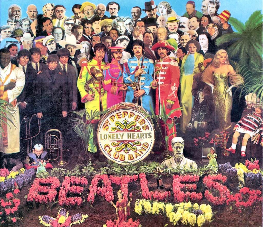
As rock and roll emerged in the 1960s, the recording artists began to play a larger role in the design process by voicing their ideas, shifting the design process stylistically and conceptually.

The 1970s expanded upon the use of photography, transitioning into more illustrations of fantasy, but the 1980s and early 1990s brought the next big shift in style with the popularity of punk music. Winston Smith is the most notable artist of this genre, responsible for the cut-and-paste collage look that is commonly associated with punk. "So well composed are the designs that they sometimes appear to be a painting. He seems most fond of using images from the 1950s, mashed-up and combined in a way to turn the innocent, happy feeling of the original pictures into rebellious, authority-questioning, psychedelic collages" (The Future of Album Art).

Like with anything in the music industry, there is going to be that battle between what the musician wants and what the record label wants. Today, however, labels are allowing more creative rights to these artists, encouraging them to become more involved in the design process. Even so, most musicians don't come up with the album's design per se, but rather how they think the album should look, what moods it should evoke. The biggest concern with musicians is the choice of photographs used. You know, don't want that picture of you in the middle of a sneeze on that front cover. And much like album artwork varies among genre, so too does the musicians' attitude toward it. "Singer/songwriters seem to care the most, followed closely by young rock bands - and young 'pop star hopefuls' seem to be mostly concerned with clothing, hair and make-up" (Grant).
Even with the creative rights permitted to artists, there still remains a lot of restriction, as artists are only able to work within the confines of what society deems as appropriate. For whatever reason, our society cannot take anything lightly anymore. Creativeness has become 'intolerance' and avant-garde has become 'politically incorrect'. Back in the 1950's and 1960's, almost any album artwork was accepted, most likely because it was still new and nobody really knew what they were doing. It is as if there now exists an implicit set of guidelines for musicians to follow. However, these guidelines seem to inconsistently vary as to what is and is not acceptable. Perhaps Winston Smith is able to get away with his social commentary designs because he is using images from the 1950's. In other words, if they were appropriate then, they should be appropriate now. I mentioned earlier that some album covers have become as famous as the musicians. Well, some albums have also become infamous, for igniting controversy over its inclusion of offensive material – or what appears to be "offensive."
Motown group The Five Keys' design for On Stage (1957) had to be altered because Rudy West's (far left) forefinger was mistaken by some to be his genitalia. The offensive digit was airbrushed away, as was Alice Cooper's thumb on the cover of Love It To Death (1971) for the same reason. It is as if the album design represents much more than meets the eye, becoming offensive not for what appears but for what others perceive them to be.
 
Artist Andy Warhol designed The cover of the Rolling Stones' Sticky Fingers (1971), controversial for featuring a pulled-down zipper. While a humorous situation in everyday life, such was not the case to critics, whose 'XYZ outcries' were addressed and implemented on reissue editions which instead display a pulled-up zipper. These same critics called for a ban on Bruce Springsteen's Born in the U.S.A. (1984) design for what appears to be "The Boss" urinating on the American flag. However, his hand could just as easily be placed within his pocket. The intent of the design has never been confirmed.
 
Why should one person's interpretation mean another person's loss? With no real set guidelines, it's difficult to identify where 'the line' is. Who has the right to say what is and isn't suitable? Forgetting about the critics and the public for a second, a major issue comes from retail stores. Wal-Mart, the world's largest retailer, has repeatedly refused to display an album on their shelves because of the content of its cover, be it sexual, violent, suggestive, or gestural. Being that a large percentage of sales are going to come from Wal-Mart stores, executives are forced to change the design in order for Wal-Mart to sell it. Wal-Mart's track record includes (from top left to bottom right): Scorpions' Love at First Sting (1984) for its partial nudity and Nirvana's In Utero (1993) both for its cover and for the song "Rape Me" printed on the back. The cover was partially changed and the printed song title was changed to "Waif Me," although the song itself remained the same. Wal-Mart decided that White Zombie's Supersexy Swingin' Sounds (1996) was too offensive FOR EVERYBODY and a blue string bikini was painted over the model on its cover. John Cougar Mellencamp's Mr. Happy Go Lucky (1996) originally featured Jesus and The Devil on its cover in order to reflect Mellencamp's close encounter with death after a nearly fatal heart attack. However, Mellencamp did not design the artwork and so he did not mind when Wal-Mart insisted that he change the cover. Jesus and The Devil were airbrushed out while the rest of the album remained the same.
 
 
While this certainly pertains to freedom of speech, there are times when design concepts come at an inopportune time. Dream Theater's Live Scenes From New York was released shortly before the attacks on the World Trade Center in 2001. Its cover "depicted a flaming NYC skyline, including the World Trade Center and Statue of Liberty" [Shock & Awe (Banned Cover Art)]. The Coup's Party Music was scheduled for release on September 12th, 2001. "The original cover had a picture of Boots Riley and Pam the Funkstress standing by burning World Trade Center towers" [Shock & Awe (Banned Cover Art)]. Both albums covers were changed out of respect for the tragic events that occurred, the latter being pushed back to a later release date to account for the cover change. You'd think that most people would make the same decision. Isn't it safe to say that artists know where the line is? Do others really need to be deciding for us? I mean sure there may be a time when something is brought forth that will strike a nerve or go too far and if that's the case, it should be the responsibility of the record label or representative to make the decision, not Wal-Mart or anybody else.
The album's design is not there for the vendor. And it's not there solely for the liking of the musicians or the designer either, but for the consumer as well, to whom it makes a substantial difference. Face it. A large portion of the fun is unwrapping that newly purchased CD, opening it up, and becoming mesmerized with the liner notes, lyrics, and artwork. It adds a whole new dimension to the purchasing decision of consumers. In her article, published almost precisely upon the release of Apple’s iTunes, Angelynn Grant predicted that this tactile experience would shift concurrently with the complete digitalization of music in the near-future, "although buying the music without any accompanying graphics is unlikely to work" (Grant). The transition from LP to CD called for a downsizing of the artwork by seventy-five percent, and with the success of iTunes and digital music, the CD has been gradually fading away, and soon there will no longer be a tangible object present in music listening.
Much like music videos and advertisements, album cover designs have remained fascinating, hip for their continued ability to implement new designs, even if they do use past influences. Though some would say hip means not changing for anybody, albums are not a living entity and cannot physically rebel. But through them, artists are given a way to express themselves, and if the need be, to voice their opinions and rebel. Surely the amount of controversy that surrounds a design on a small piece of paper would represent its hipness. Does this mean that hip is fading away?
Through its inclusion of on-screen mini-art, an inch by inch picture of the album’s cover that displays on the iPod's screen, Apple has recognized the importance of the album’s artwork (note the sarcasm). Oh, and there's no insert either. You buy an album, you get the tracks and the bouillon-cube-sized artwork, that's it! Lost, it seems, is the fun and creativity in music listening. Ricardo Baca argues that the magic of album covers has not been lost, but rather has become hard to see. "There’s as much creativity and beauty in cover art today as there was in the 1970s - maybe more. But through the glare of a jewel case or the scratches on an iPod screen, it doesn’t look as majestic" (Baca).
Apple's first attempt to accomodate for the lost goodies was with the 'digital booklet' in 2004. The digital booklet is a PDF file of all the information from the liner notes. You can't use them on your iPod, but you can print them out and put them in a jewel case of your own! As you can see, the response wasn't exactly overwhelming. If anything, it was a step backward. The latest attempt, however, has incorporated video and, slowly but surely, has made progress. A company called TuneBooks has teamed up with Apple and introduced interactive liner notes (a working title, I hope), featuring lyrics, photos, links to websites, and merchandise. And it even works on the iPod! How 'bout that? Check out a sample here:
http://www.cddesign.com/covertalk/images/Untitled-1.html
Sure, it may not have that factory-fresh smell, and you won't get the same thrill you did opening the shrink wrap of the CD but, inevitably, the digital revolution is upon us. As I mentioned before in my discussion about advertisements, we love us some technology. Whether TuneBooks becomes the new standard or just another pixel on the ever-changing portrait is determinable only by the test of time (probably a few months).
Works Cited
Baca, Ricardo. "LP Cover Art in the iPod Era." The Denver Post 2 Apr. 2006: F1.
Grant, Angelynn. "Album Cover Design." Communication Arts January/February 2001.
http://www.commarts.com/ca/feadesign/album
Kasprzak, Donald. "The Art Of The Album Cover On-Line Exhibit." William F. Eisner Museum of Advertising & Design.
http://www.eisnermuseum.org/_albums/albumcovers.swf
Rybacki, Donald Jay., and Karyn Charles Rybacki. "Cultural Approaches to the Rhetorical Analysis of Selected Music Videos." Transcultural Music Review 3.1 (1999)
http://www.sibetrans.com/trans/trans4/rybacki.htm
"Shock & Awe (Banned Cover Art)." Rate Your Music.
http://rateyourmusic.com/lists/list_view?list_id=5747&show=25
&start=0
"The Future of Album Art?" CD Design and Album Cover Art.
http://www.cddesign.com/covertalk/archives/the_future_of
_album_art.html
Pogue, David. "Online Music With All The Extras." The New York Times 6 June 2006.
http://pogue.blogs.nytimes.com/2006/06/01/01pogues-posts |


